Responsive Landing Page
Modern CSS made most media queries unnecessary — this page counts the ones that survived.
- HTML
- CSS
About this project
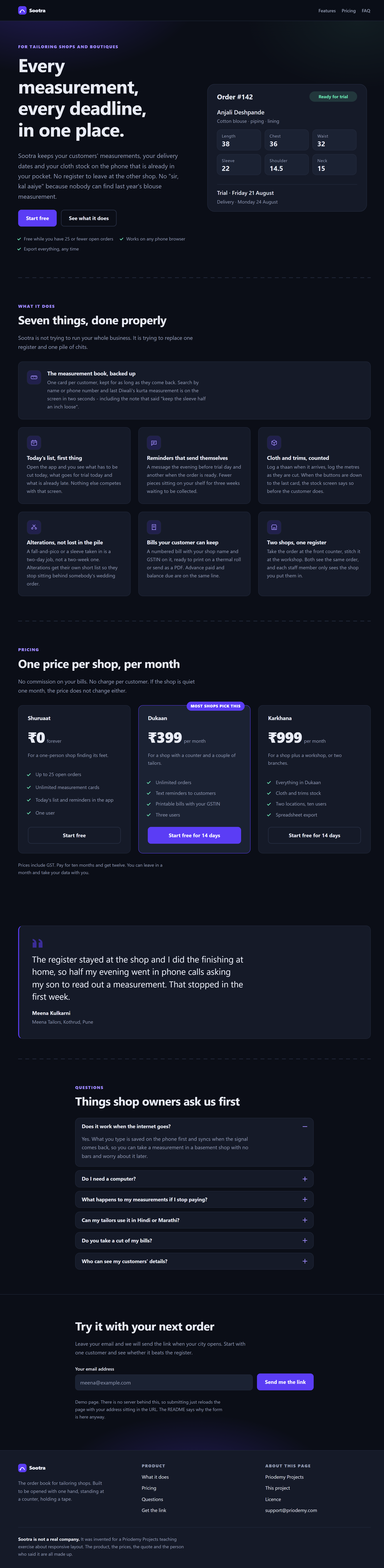
A complete landing page for a fictional product — hero, features, pricing, testimonial, FAQ and footer — that works from a 360px phone to a wide desktop. HTML and CSS only: no JavaScript, no framework, no build step, and no external font or image. Every graphic is CSS or inline SVG.
The idea it is built around is that modern CSS has made most media queries unnecessary. Grid with auto-fit, flex-wrap, clamp() and minmax() let a layout adapt continuously instead of snapping at three widths somebody picked in 2014. The page is built that way and then counts the media queries it actually still needed, explaining what each one is for — because a breakpoint should come from the width at which your content stops working, not from the screen size of a phone that is now six years old.
The second theme is that a landing page is a document before it is a design. Heading order that makes sense read aloud, real landmark elements, a skip link, alt text that says something, and a focus ring you can actually see.
What you will learn
- Lay out with grid, flex-wrap, clamp() and auto-fit so the page adapts continuously
- Choose a breakpoint from where your own content breaks, not from a device you own
- Use fluid type and spacing instead of stepping sizes at arbitrary widths
- Build a landing page as a document first — correct heading order, landmarks, a skip link
- Understand why a div with an onclick is not a button
Before you start
- HTML and CSS basics — selectors, the box model, and what a class is
- A browser and a text editor. Nothing to install.
New to HTML? The free HTML course covers everything this project assumes.
Academic integrity notice
These projects are provided for learning, experimentation and reference. Understand the code, modify it for your own requirements, and acknowledge external work according to your institution’s academic policies. Priodemy does not supply work to be submitted as your own.
Features
- Hero, feature grid, pricing table, testimonial, FAQ and footer
- Continuous layout with grid auto-fit, flex-wrap, clamp() and minmax()
- Fluid type and spacing, so nothing jumps at a breakpoint
- Every graphic is CSS or inline SVG — nothing is fetched from anywhere
- Correct heading order, landmark elements, a skip link and visible focus
- Works from 360px upward with no horizontal scrolling, verified
Technology stack
Track: Web Development · Level: Starter
What is included
- index.html and style.css — commented throughout
- A README on breakpoints, fluid sizing, and why the media query count is low
- Suggested extensions, including a dark mode and a second page
Delivered as a 30 KB ZIP. SHA-256 published under Changelog so you can verify it.
System requirements
- Operating system
- Any
- Runtime
- Any modern browser. No install, no build step.
Licence
Learn from it, change it, and use it in your own coursework and personal projects. Do not resell it or pass it off as your own original work.
- Personal and educational use
- Modifying the code however you like
- Using it as the basis of your own coursework, with honest acknowledgement
- Putting your modified version in a portfolio or on your own GitHub
- Reselling or redistributing the project, modified or not
- Presenting it as your own original work
- Commercial deployment — see the Commercial licence
Support window: 6 months from download.
Frequently asked
Is the product on the page real?
No, and the README says so plainly. It is invented so the page has something honest to sell. It does not imitate any real company, and you should replace the copy with your own rather than shipping ours.
Why so few media queries?
Because grid auto-fit, flex-wrap and clamp() already adapt continuously, and a layout that adapts continuously does not need to be told what to do at 768px. The ones that remain are there because the content genuinely breaks at that width, and each is commented with the reason.
No JavaScript at all?
None. The FAQ uses details and summary, which are HTML elements that already open and close. Reaching for JavaScript to do what the markup does for free is how pages end up inaccessible.
Changelog
- First release
SHA-256f4988a048637081135f2a9e201ad15c14d4dd357af8c3bf0bc8ec22dea1eede5
You might also like
 Free
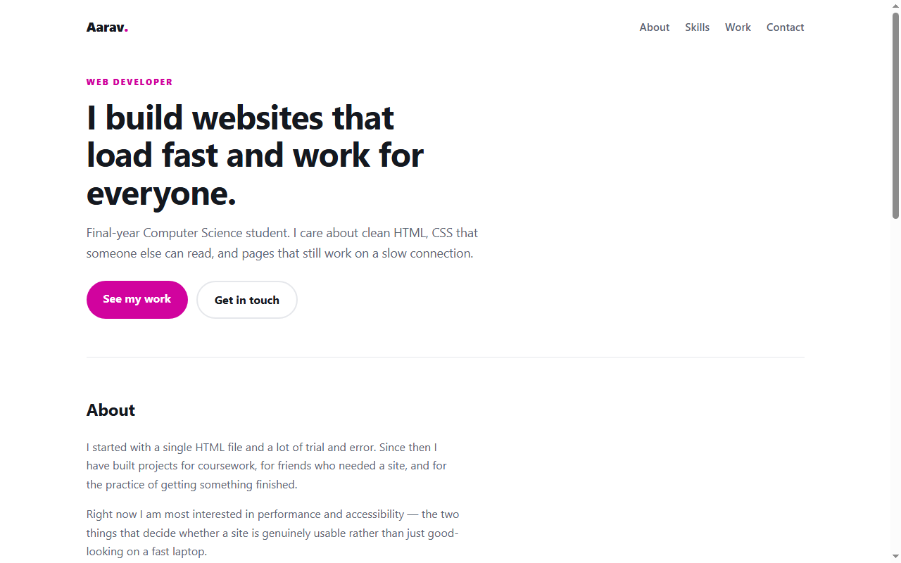
Free Personal Portfolio Website
A responsive portfolio in plain HTML and CSS — no framework, no build step.
- HTML
- CSS
 Free
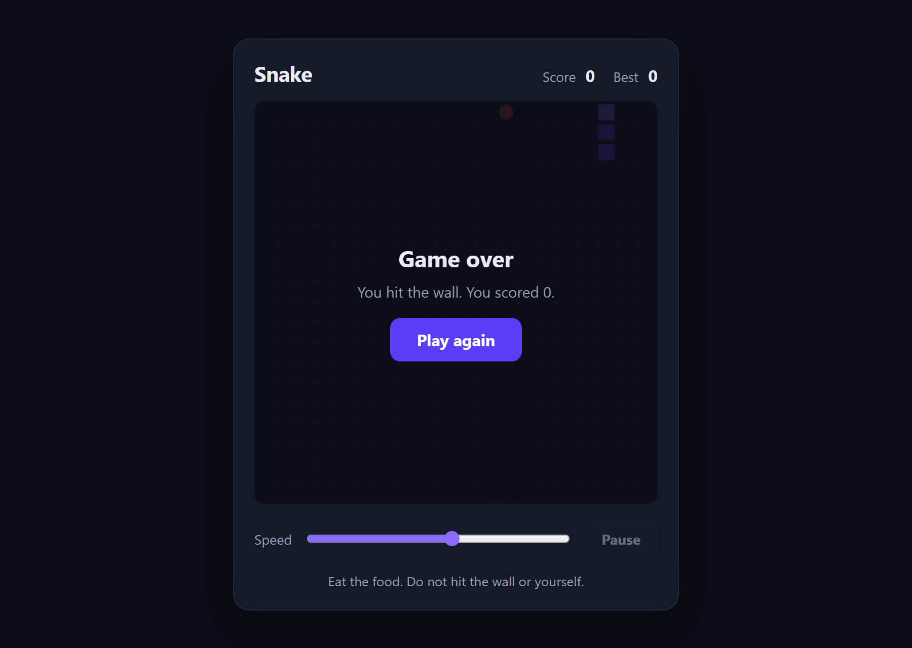
Free Snake Game
The classic game in about 180 lines of plain JavaScript and a canvas.
- JavaScript
- Canvas
- HTML
 Free
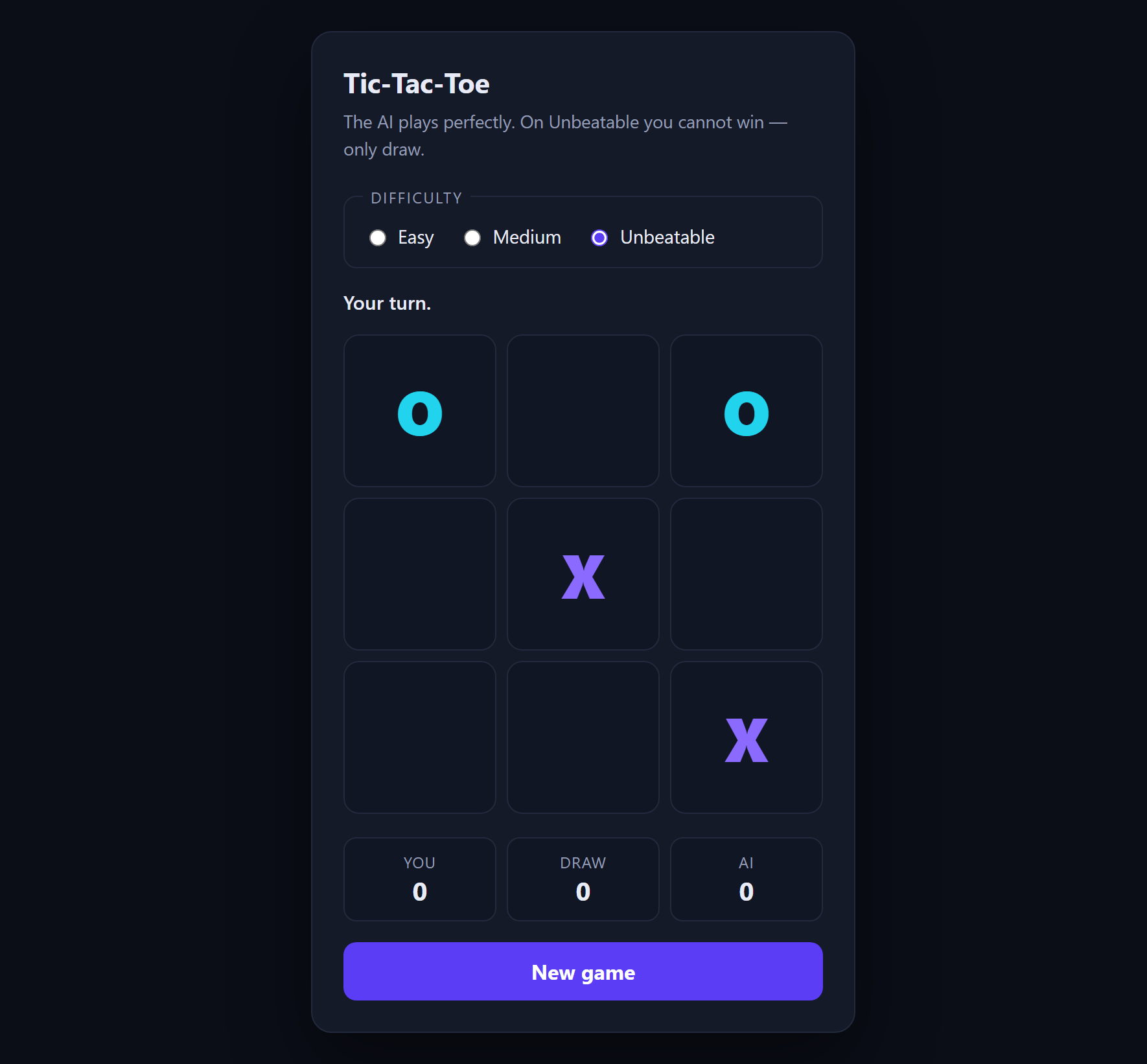
Free Tic-Tac-Toe with AI
An opponent that plays perfectly, using minimax with alpha-beta pruning.
- JavaScript
- Minimax
- HTML
 Free
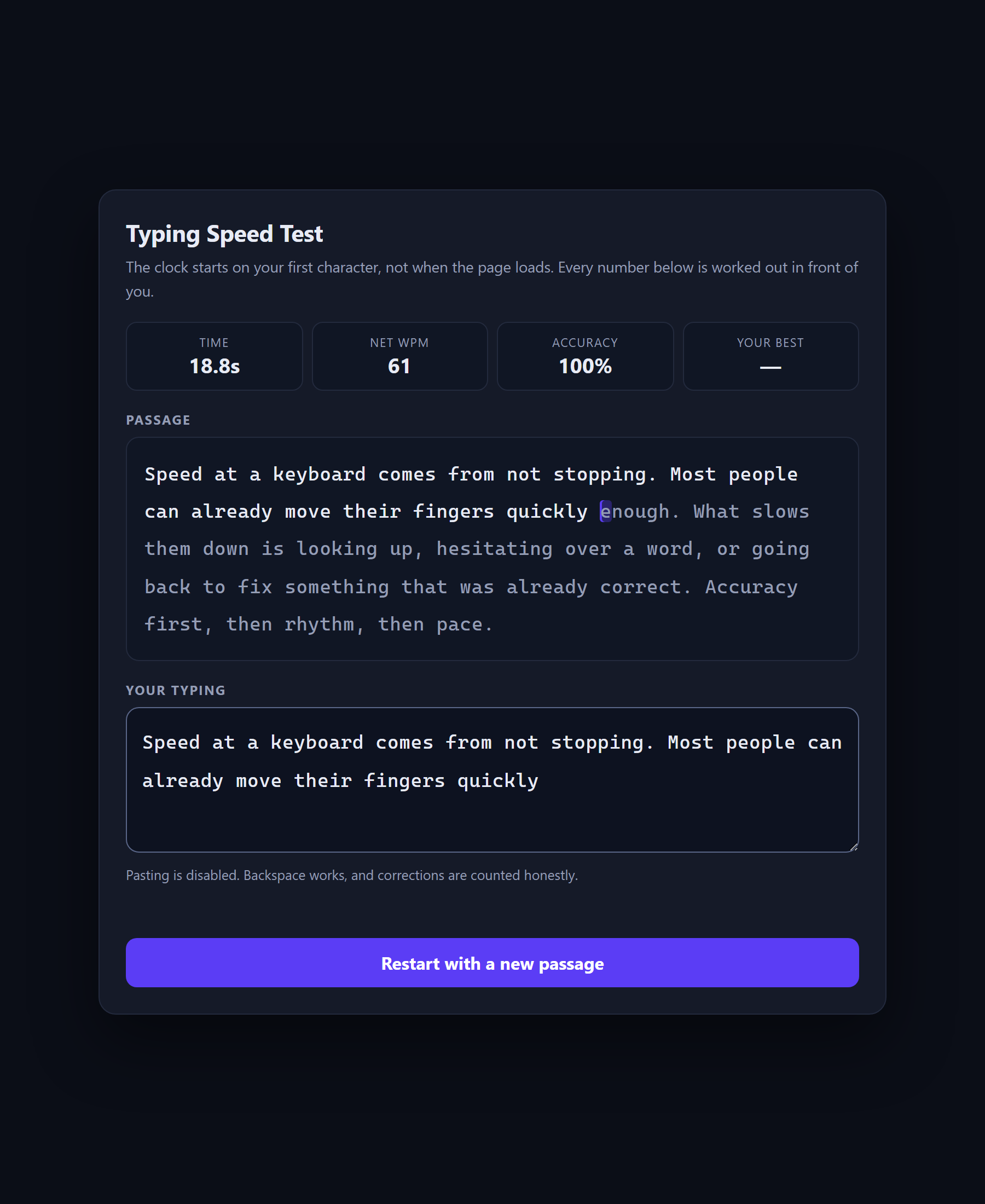
Free Typing Speed Test
A speed test that shows its own arithmetic, because WPM is a definition rather than a measurement.
- JavaScript
- CSS
- HTML