Data Analysis with pandas
The summary statistic you choose is an argument, not a neutral fact.
- Python
- pandas
- Matplotlib
About this project
A pandas analysis over a year of retail sales, producing summary tables and four saved charts. The data is synthetic — generated by a script with a distribution we chose — and the project says so in its own output rather than implying it is real trading data.
The idea it is built around is that the summary statistic you pick is an argument. On this data the mean order is about six times the median, because a handful of bulk orders drag it upward; only about one order in seven is as large as the "average" order. Print the mean alone and you have described a shop that does not exist. The project prints both on the same column and lets the gap make the point, including the moment where mean minus one standard deviation gives a negative order value — correct arithmetic, meaningless summary.
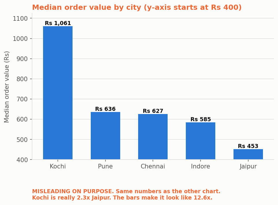
The charts carry the same theme. The same city comparison is drawn twice, once from a zero baseline and once from a truncated axis, and the script prints the measured exaggeration between them. One chart is labelled misleading on purpose.
What you will learn
- Group, aggregate and pivot with pandas rather than looping over rows
- Choose between mean and median on skewed data, and justify the choice
- Read skew and standard deviation, and notice when a summary has stopped describing anything
- Draw the same data honestly and misleadingly, and see how much a truncated axis changes it
- Save charts to PNG from a script, so the analysis is repeatable rather than clicked
Before you start
- Python basics — functions, lists and dictionaries
- Python 3.10 or newer, plus pandas and matplotlib (one pip command)
New to Python? The free Python course covers everything this project assumes.
Academic integrity notice
These projects are provided for learning, experimentation and reference. Understand the code, modify it for your own requirements, and acknowledge external work according to your institution’s academic policies. Priodemy does not supply work to be submitted as your own.
Features
- A full year of synthetic retail sales across five Indian cities and six categories
- Mean against median on the same column, with skew and standard deviation alongside
- Group-by summaries per city, category and month
- Four charts saved as PNG, including the same data drawn honestly and misleadingly
- The axis-truncation exaggeration measured and printed rather than asserted
- Text bar charts in the console output, drawn from zero so they cannot be stretched
Technology stack
Track: Data & Analytics · Level: Mini project
What is included
- analyse.py, charts.py and sales.csv — commented throughout
- A README on mean versus median, skew, and how a truncated axis misleads
- Suggested extensions, including a moving average and a cohort view
Delivered as a 31 KB ZIP. SHA-256 published under Changelog so you can verify it.
System requirements
- Operating system
- Any
- Runtime
- Python 3.10 or newer. pip install pandas matplotlib
Licence
Learn from it, change it, and use it in your own coursework and personal projects. Do not resell it or pass it off as your own original work.
- Personal and educational use
- Modifying the code however you like
- Using it as the basis of your own coursework, with honest acknowledgement
- Putting your modified version in a portfolio or on your own GitHub
- Reselling or redistributing the project, modified or not
- Presenting it as your own original work
- Commercial deployment — see the Commercial licence
Support window: 6 months from download.
Frequently asked
Is the data real?
No, and the program says so at the top of every run. It is generated from a fixed seed with a distribution we chose, which is what makes the mean-versus-median lesson reproducible. Presenting invented data as real trading figures would be the exact dishonesty this project is about.
Why does the project draw a deliberately misleading chart?
Because you will meet them, and the fastest way to learn to spot one is to draw one. The same five numbers plotted from a zero baseline and from a truncated axis look like completely different findings — the script prints how much the truncation exaggerated the difference.
Is this enough for a data analytics mini project?
It is the right scope for one. Group-by, pivots, skew and chart honesty are all examinable. Swap in a dataset from your own domain, extend the analysis, and write your own report.
Changelog
- First release
SHA-256c326693665f02eefe0c64d0d6a061cd910e94f38b074c4ff255099cfe9f12446
You might also like
 Premium
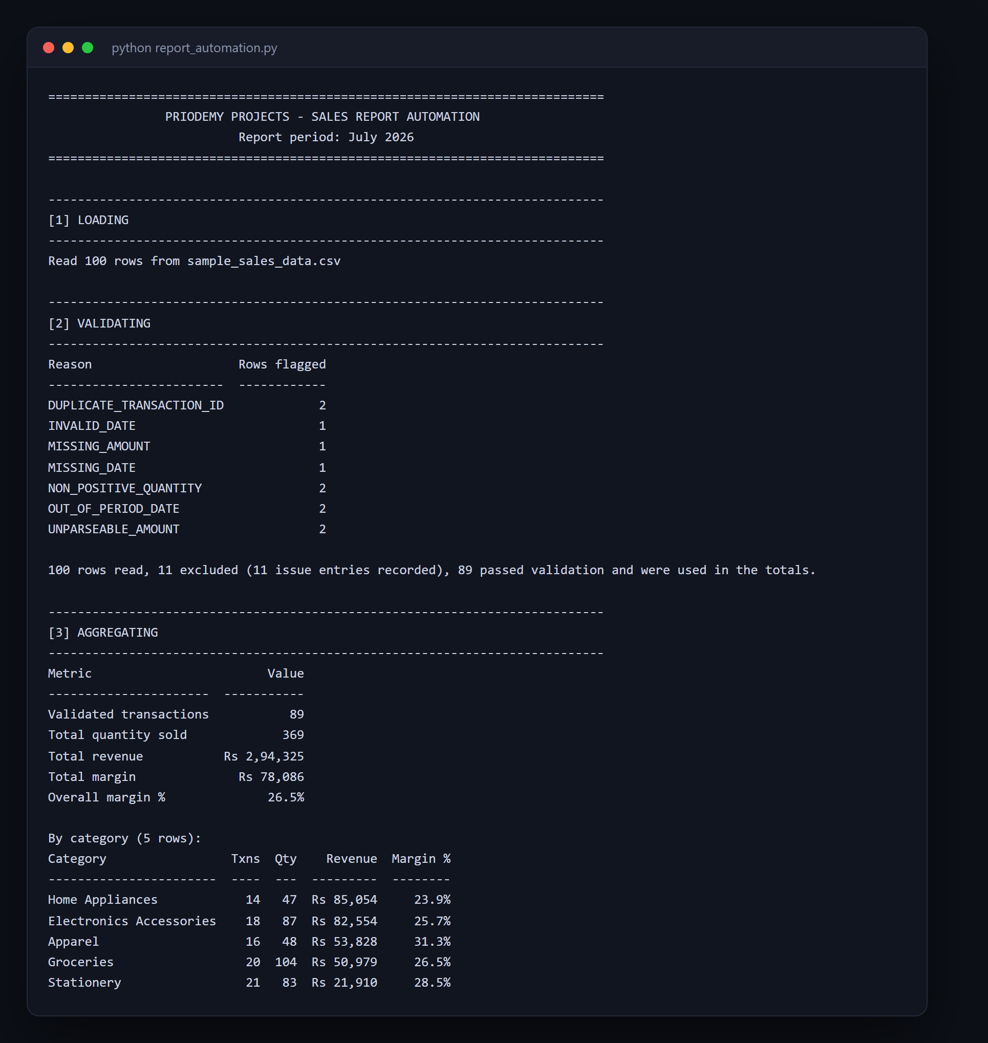
 Report Automation
A report that silently trusts its input produces a polished, wrong number — and nobody double-checks a report that looks finished.
- Python
- openpyxl
- pandas
 Free
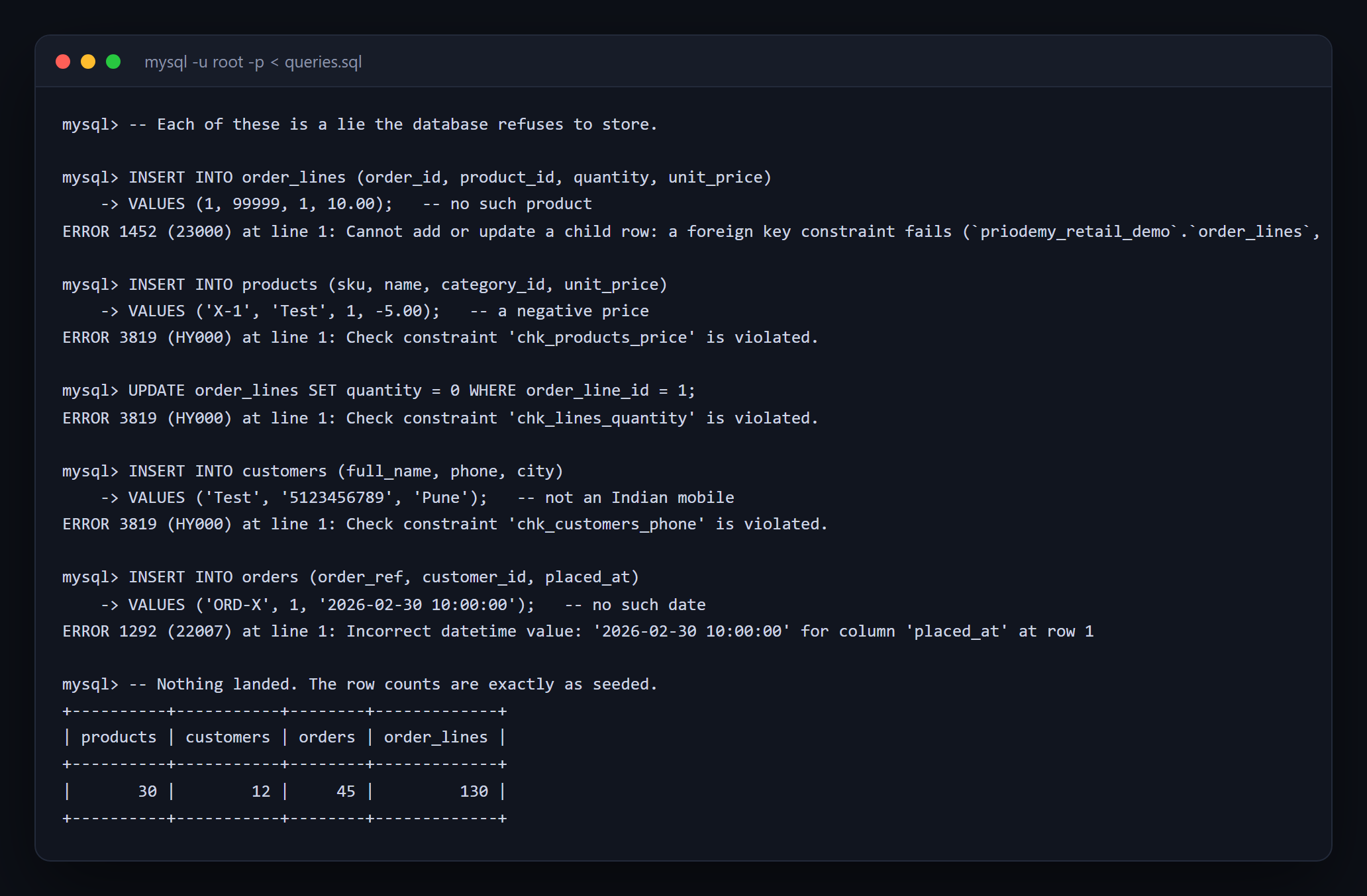
Free Retail Database Design (SQL)
Normalisation is not bureaucracy — it is the prevention of lies, and the error message is the feature.
- SQL
- MySQL
 Pro
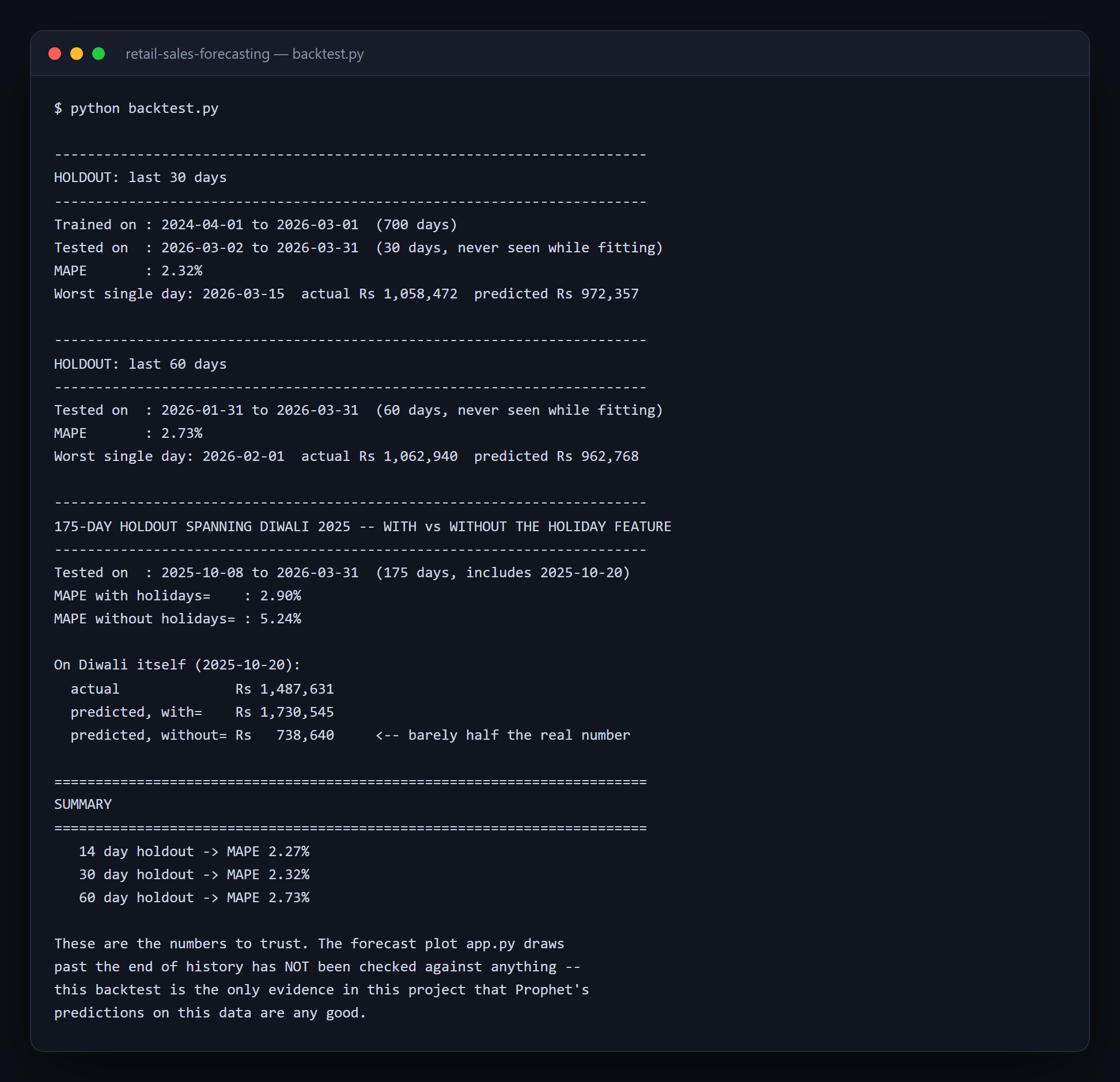
Pro Retail Sales Forecasting
A forecast chart nobody backtested is a drawing — the only honest accuracy number comes from data the model never saw.
- Python
- Prophet
- Streamlit
 Free
Free ATM Simulation System
A working cash machine in Python and MySQL — balance, withdrawal, deposit and a transaction history.
- Python
- MySQL
- mysql-connector